
As a UI/UX Intern at Branch, I led a UI audit and systemization effort to address visual inconsistencies across the platform. The result was a set of scalable, reusable design system components to unify the product experience.
Outside of this particular project, I also began platform framework design explorations, which are not covered in this case study.
Role: UI/UX Intern
Team: 1 Designer (me), Design Director, PMs, Software Engineers
Tools: Figma, Google Suite, Notion
Timeline: 3 months
Branch’s platform had grown rapidly, accumulating inconsistent spacing, exceedingly various button styles, mismatched input fields, and conflicting text hierarchies. These inconsistencies weren’t just aesthetic—they led to confusion, friction, and extra guesswork for users. What should have been intuitive was starting to feel unpredictable.
Example. "Add Filter" buttons
All these buttons do the same thing, but look very different.

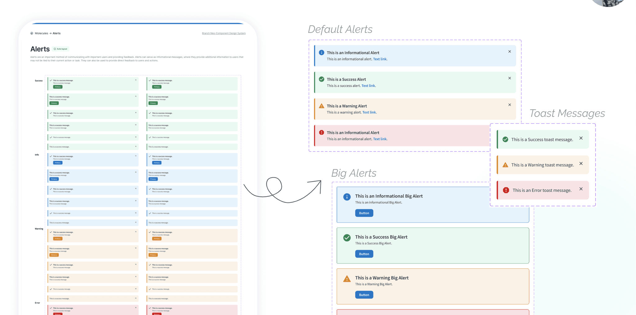
Example. Alerts
Alerts did not have consistent formatting, and it was unclear whether each different version should or should not be dismissable.

Knowing I couldn’t fix everything at once, I focused on the flows that mattered most to our users—and where the inconsistencies were causing the most pain.
I conducted a UI audit across three core user flows, cataloging inconsistencies in buttons (12+ variations), text fields (some with labels, some without), and typographic styles (including multiple font weights being used interchangeably). I organized this into a Figma documentation file to serve as a central reference for our team and engineering partners.
I worked closely with engineering to ensure proposed components aligned with existing code, often adjusting designs to match what was feasible in the current system.

Notion Notes
Initial impressions of my own first experience using the platform was recorded with notes in Notion, including screenshots and recommendations on how we might improve the issue.

Themes Grouping
Beyond just visual polish, I started noticing broader usability themes in our product. These weren’t one-off bugs—they were systemic patterns affecting how people navigated and understood the product.

UI Inconsistencies Documentation
Absolute, complete documentation of all inconsistencies found on the site spanning 7 major UI areas (tooltips, error messages, date pickers, navigation, form fields, buttons, empty states) were documented by me, including details of where they could be found, under what conditions, and how exactly to fix them. This was a complete & exhaustive list and was referenced as the official plan of changes by PMs and engineers.
Creation and Dictation of Standardized Components
I dictated standards for all components in our 7 major areas - reducing the amount of optional pieces and thereby reducing large amounts of variation in the design system. I also created new components and content formats, pushing forward a new design process that allowed no ad-hoc creations by other designers and engineers.
I created a foundational design system in Figma, which included standardized components like button variants (primary, secondary, destructive) and input fields with defined states (active, error, disabled). I also added clear usage guidelines to support consistency in implementation.
These updates were reviewed by engineers and used as a reference during feature development. My documentation became a go-to resource across teams, helping reduce ambiguity, align implementation, and establish a more consistent design foundation—even beyond my internship.
Although implementation was still in progress when I wrapped up, I’m proud to have contributed to a more thoughtful and cohesive platform.

Working on the UI Enhancements Project at Branch showed me how impactful small, systematic changes can be at scale. While the work wasn’t flashy, it was quietly powerful—exactly the kind of behind-the-scenes magic that makes a product feel smooth, trustworthy, and professional.
It also taught me how to work closely with engineering to align design decisions with technical constraints, and how documentation can empower cross-functional teams to move faster and more consistently. This experience deepened my appreciation for design systems and gave me the confidence to contribute structure and strategy — even in environments where visual polish isn’t the priority.
