MBA regularly receives donated specimens and artifacts with no centralized inventory system. This creates inefficiencies that make it harder for departments to borrow items, as well as for the admins who approve the borrow requests—slowing down everyone's work. My team partnered with MBA to investigate and design a solution to this problem!
Team.
Design—
Catherine Gu,
Christy Seguritan
Research—
Jesse Fan
Masters Capstone Project
My Masters program (MHCID) partners with several non-profit organizations in the United States to give students a chance to work on real-world problems and build real solutions, culminating in our capstone project. My team was partnered with Monterey Bay Aquarium ("MBA")!
The Design Problem
Each year, supporters of the aquarium's mission donate collected specimens spanning the entire spectrum of the ocean’s biodiversity. These artifacts are a valuable resource for researchers, educators, and students interested in studying ocean life, and are often lent out to other departments for learning enrichment. Monterey Bay Aquarium employees have thus far been storing these artifacts in labelled boxes on shelves, and rely on memory and searching to find artifacts to lend to other departments.
Our Goal
"Bryant is the database. He knows where everything is."
We designed a centralized, searchable database with detailed entries to give everyone real-time access to inventory information.
The Database is Bryant's Brain
During our context gathering, the "database" was often joked as being located in a singular employee's brain, Bryant's—relying only on his memory. This means that other team members and borrowers are always unsure about artifact availability or status, and turned to him to find out. This lack of transparency can lead to delays, miscommunication, and a system that becomes unsustainable as the collection grows.
We addressed this by designing a centralized, searchable database with categorized views of the full inventory. Each entry includes details like availability, scientific names, care instructions, and preservation methods, giving team members easy, real-time access to accurate information. Team members designated as an admin can also edit or add new data entries.
Understanding the Overall Picture
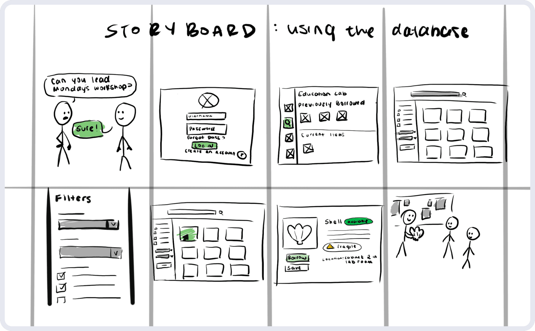
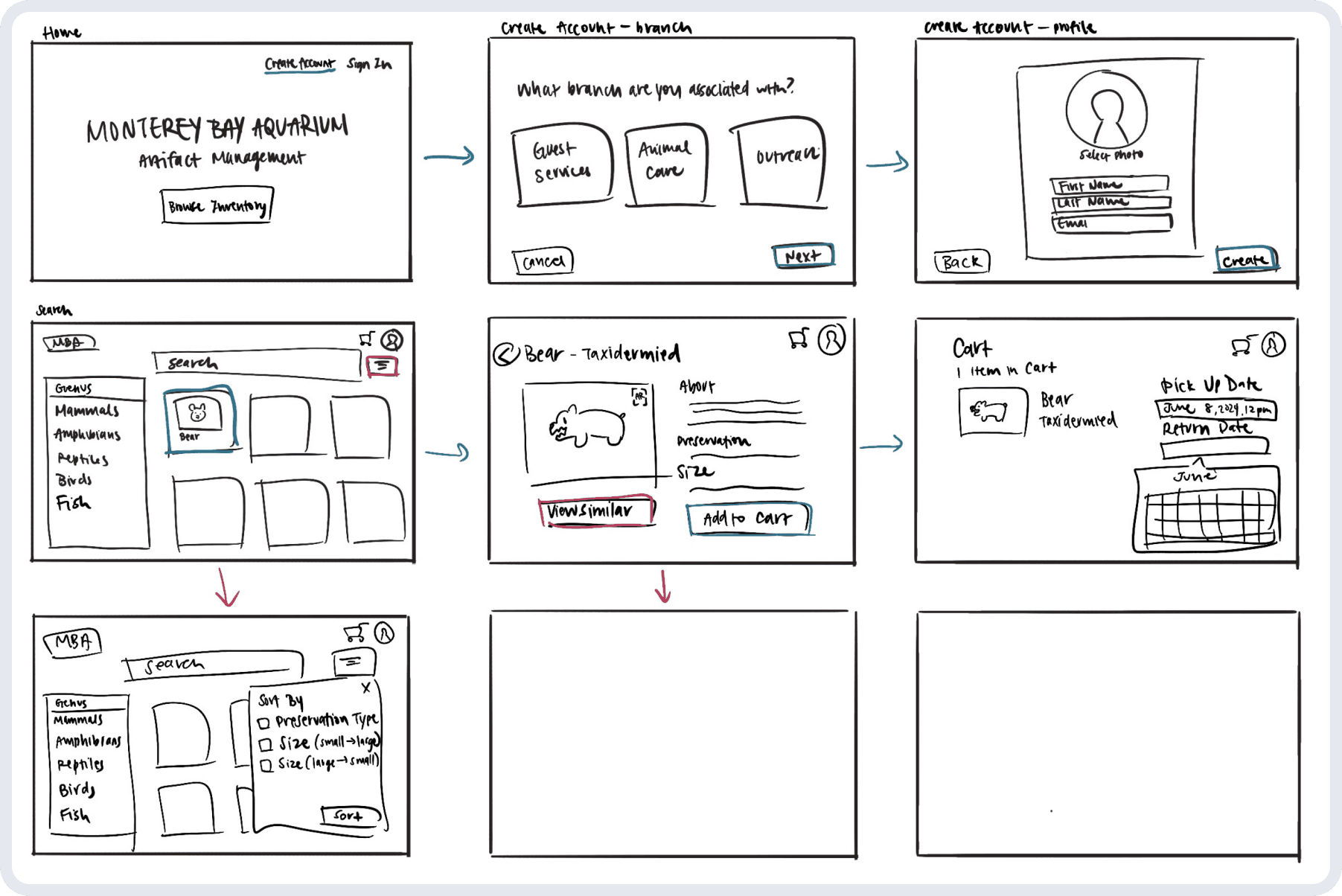
During our brainstorming sessions, we focused on integrating the database with the borrowing process described by MBA employees. To ensure the concept made sense, we created initial storyboards to map out the flow. As we sketched, it became clear that the platform would resemble an online shopping experience—allowing users to browse items, add them to a cart, and "check out" (in our case, submit a borrowing request).
Big Picture Storyboard
Close-up Storyboard
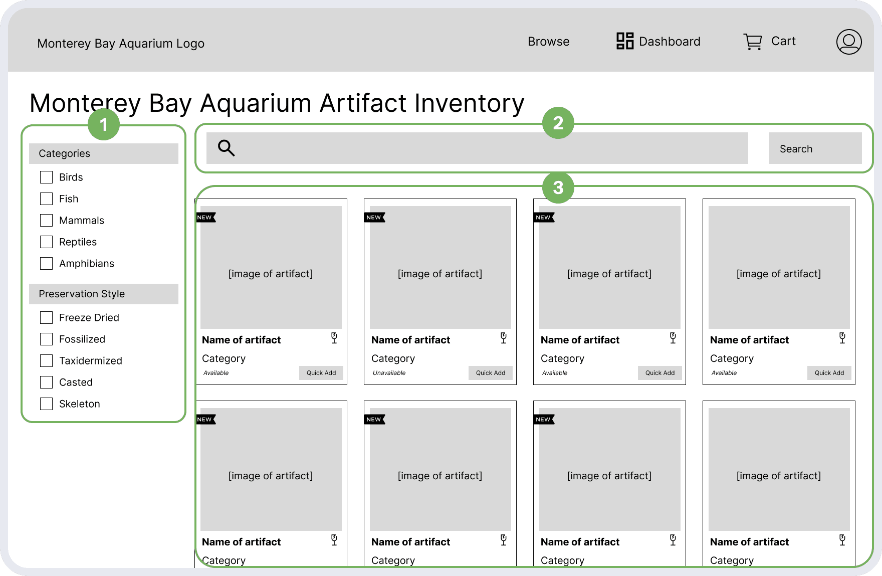
Database Catalog Wireframes
Catalog
1
Unique filters that are specifically relevant for the artifacts MBA collects
2
A search function that shows real-time suggestions based on user input
3
List of artifacts, each item container with tags and other descriptive characteristics
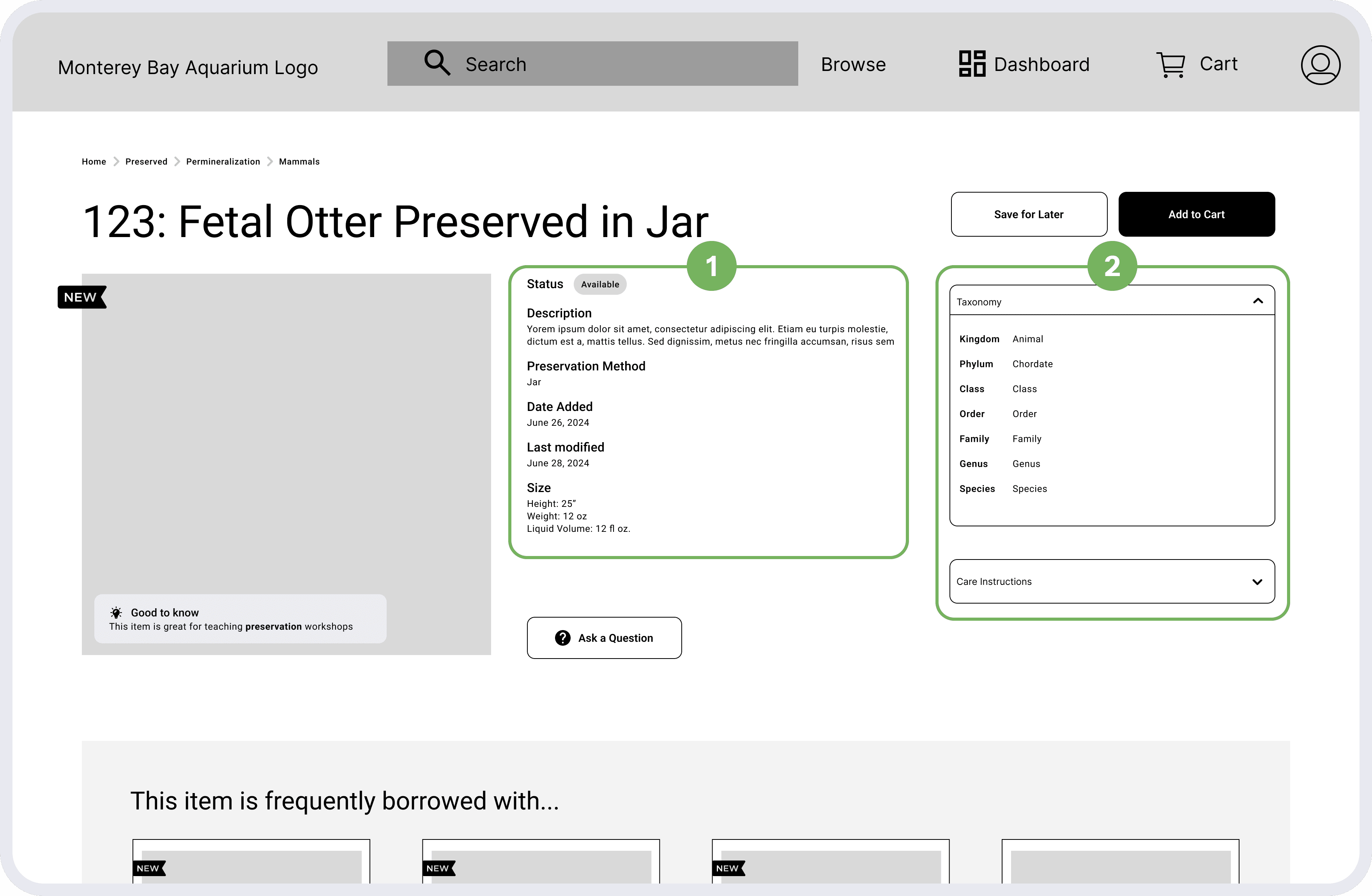
Clicking into any of the item containers would bring you to a new page that shows more details about it:
Item Detail
1
Item & entry details, including availability for borrowers
2
Taxonomy, which is particularly relevant to the artifacts that MBA collects
Feedback & Iteration
With some initial wireframes, we gathered our users online for an initial testing & feedback session to see if we were going down the right path. Coming away from it, we had three major pieces of feedback to incorporate to improve our designs:
More specific filters—the current categories are too vague
More sorting options—want to browse listing for other reasons
Prioritize relevant information on item detail page
These changes would give the granular control that MBA was looking for. Because we had a limited timeframe, we decided to make these changes alongside our transition into a higher fidelity.
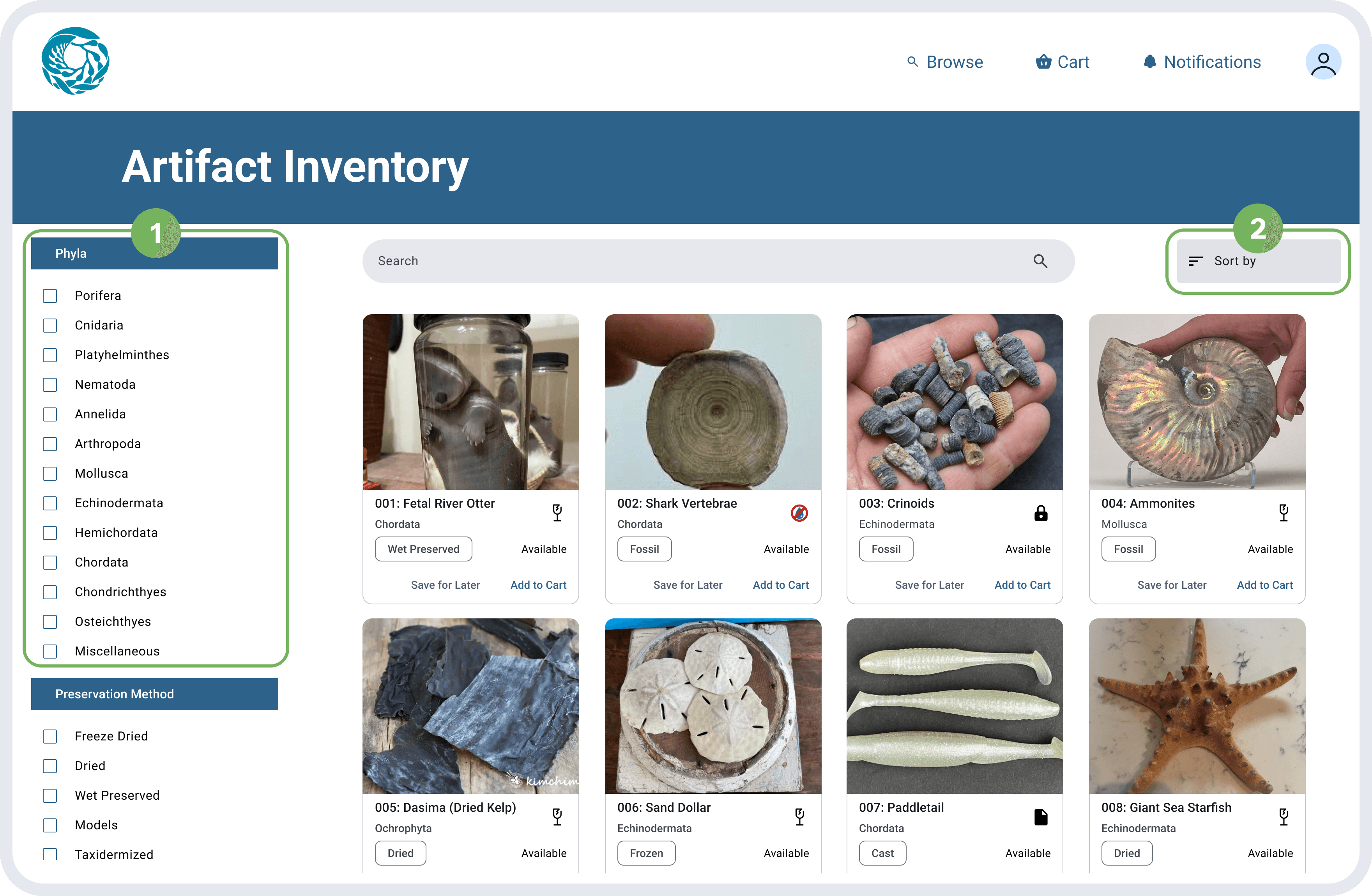
Catalog
1
Filters are more granular, listing by Phyla instead of general terms
2
A "Sort by" button was added to sort by other common methods, such as alphabetical or by age
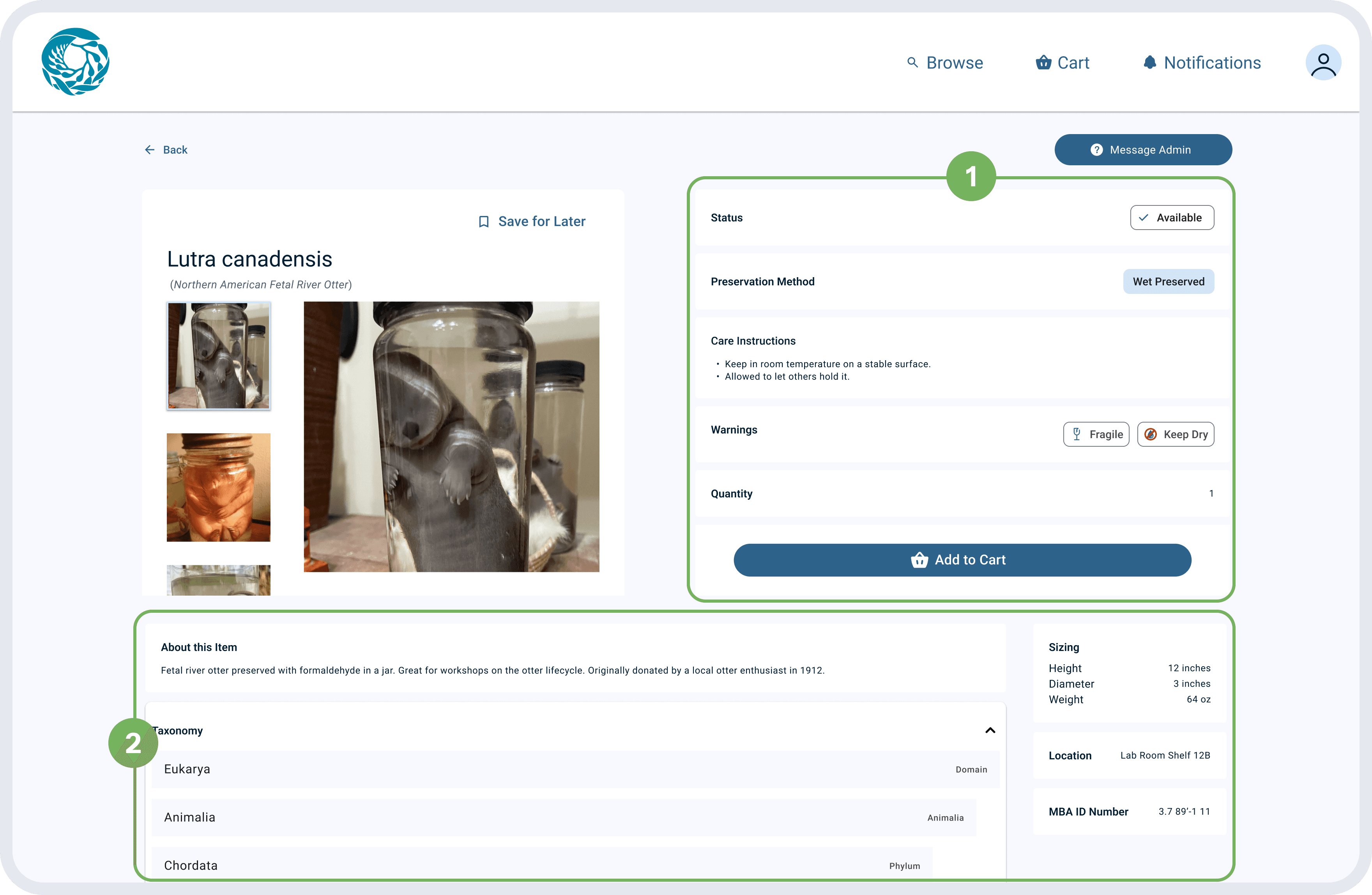
Item Details
1
Information related to borrowing the item is given more space, prioritized for prospective borrowers
2
Additional details, such as size and taxonomy, are secondary but still given ample space
Employees can now retrieve and update inventory information without relying on Bryant, saving time for everyone involved.
"Other people will email me if they want to borrow something. Then I email them back to ask them for more details. We'll schedule to meet up once or twice in-person to go over what artifacts are available and what they want to borrow."
Back-and-forth communication causes frequent delays in the borrowing process.
Shopping for Artifacts to Borrow
Requesters rely on back-and-forth emails and in-person conversations with the admin to borrow artifacts, a process that is slow, error-prone, and inconsistent. Without a standardized format, approvals can be complicated, often requiring multiple trips to the storage area and creating unnecessary work for both parties.
We designed an integrated borrowing system that lets requesters browse, request, and track items in one platform. Admins have a unique view and can receive these requests, review all the standard information, and choose to approve or reject the request. An approval comes with a set pick-up time, and rejections can be sent along with clarifying comments.
By streamlining approvals and providing real-time request statuses, the system minimizes communication delays, while allowing borrowers to specify timelines and purposes upfront for a smoother, more efficient process.
Borrow Request Flow Wireframes
This flow would resemble an online shopping experience—requesters can browse item listings and add them to cart, and then submit that cart as a borrow request.
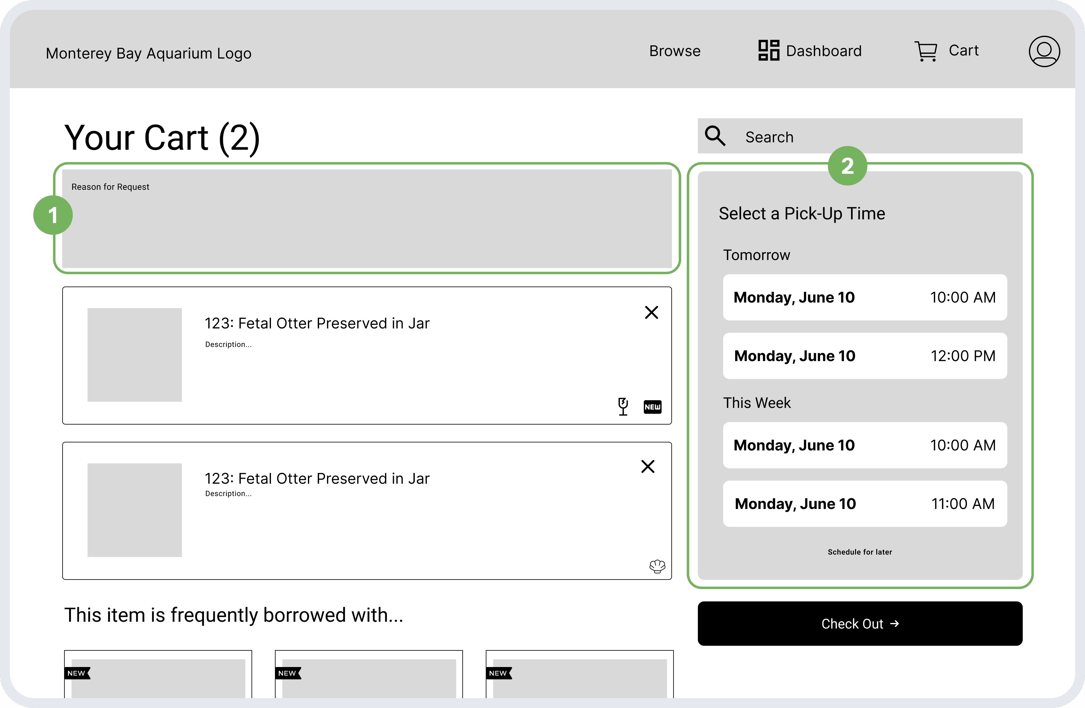
Your Cart
1
In the "Cart," requesters can give more context in a long-form text box
2
Pre-set pick-up times for easy selection
Requesters can view all details about their request(s) on the Dashboard, where they can see which items they currently have borrowed (if any), pending requests, and a history of past borrows.
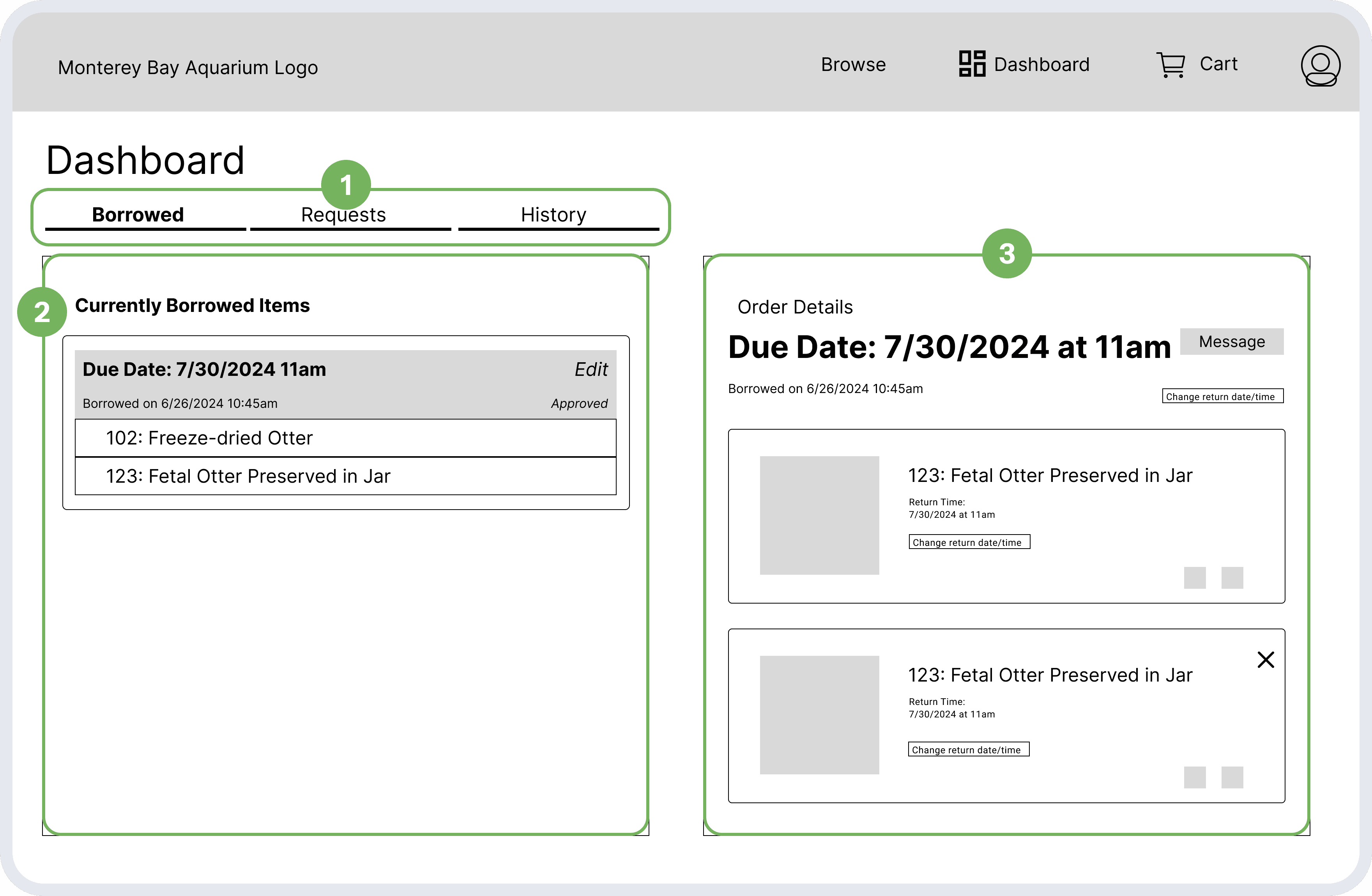
Requester Dashboard
1
Left-hand side has 3 tabs that filter between Borrowed (actively borrowing), Requests (pending), and History
2
Depending on the tab selected, the content area shows the corresponding information
3
Additional information on a specific request populates on the right-hand side if clicked on
Feedback & Iteration
From our feedback session, we again found some major areas to improve:
Easier way to provide context—typing it all out is cumbersome
Pre-set times are too constricting—and scheduling beyond them is hard
Dashboard tabs are vague— "Borrowed" vs. "Requests"
Half the dashboard page is unused, until they click on a specific request
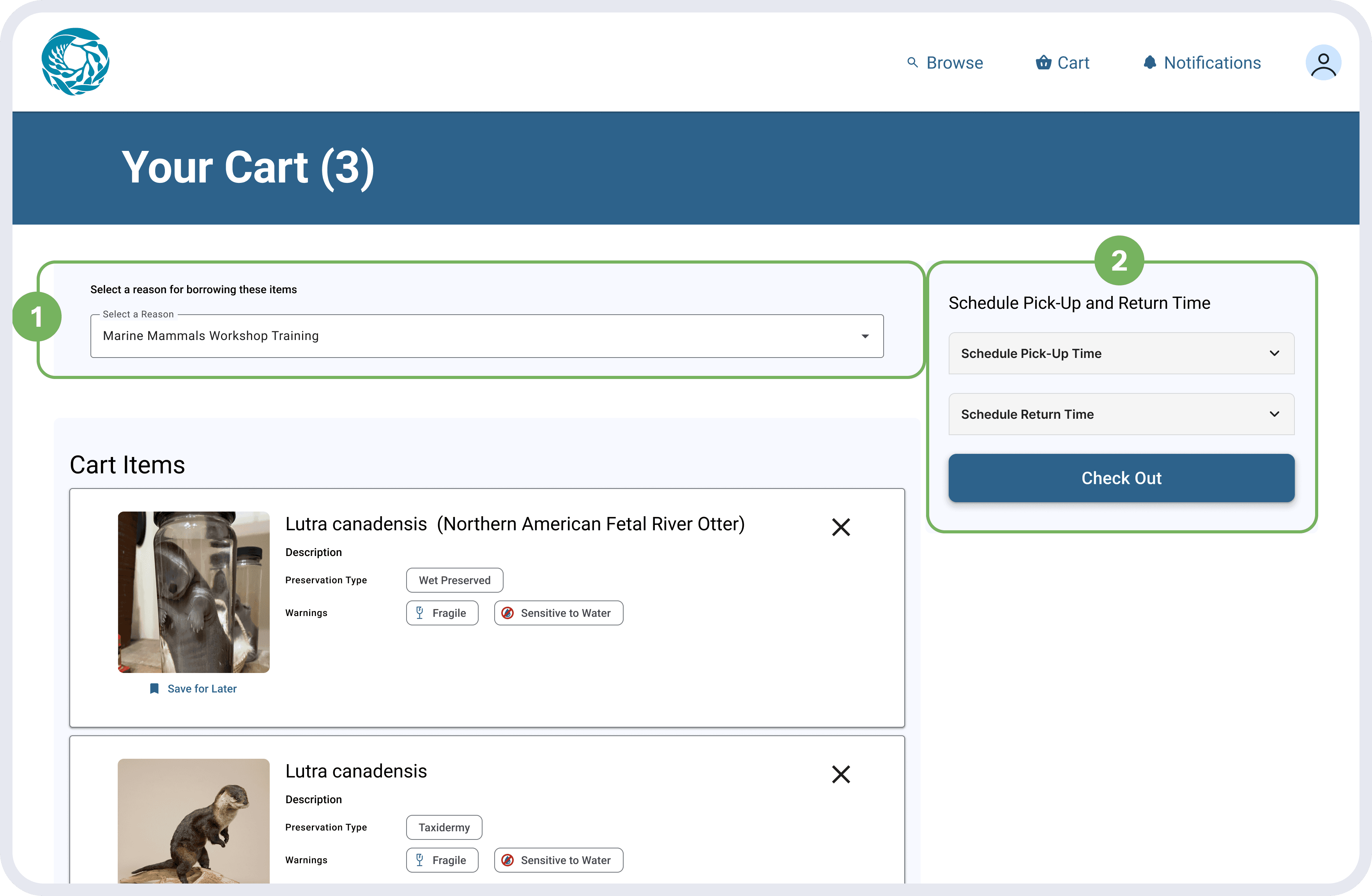
Your Cart
1
Instead of a text box, there is now a dropdown menu that contains common reasons for borrowing
2
Pre-set times were taken away in favor of more granular control via a calendar and time selector
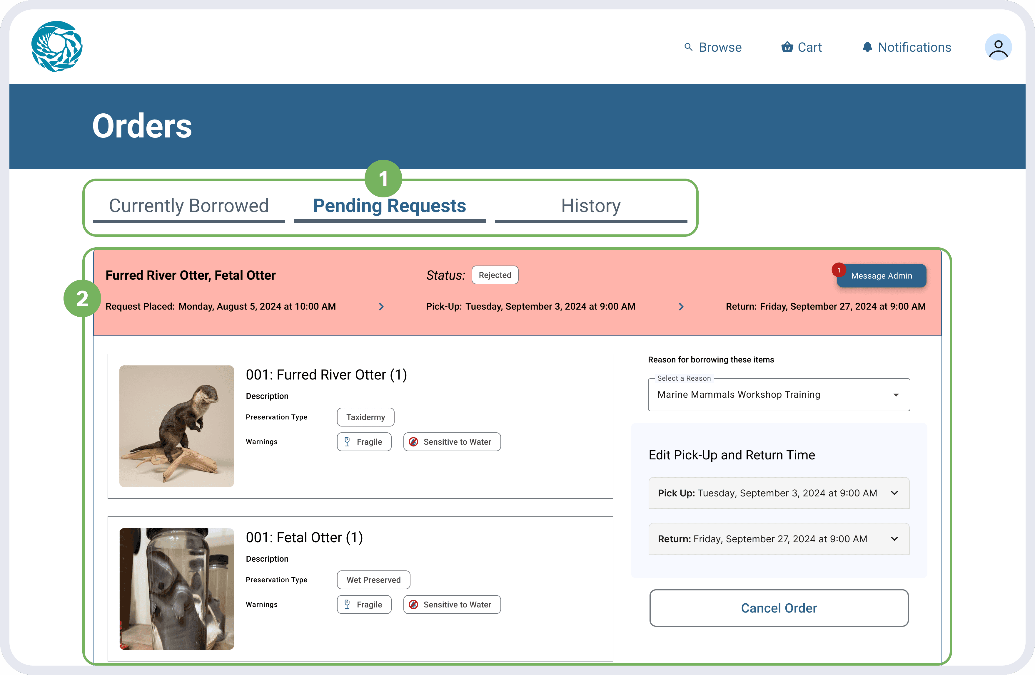
Requester Dashboard
1
Tab labels are more descriptive
2
Content layout is now one-column to use space more efficiently, and request details are displayed outright
The time required to process and fulfill borrowing requests is reduced significantly, allowing the admin to focus on other work tasks. In our testing sessions,
"I'm trying to train up these other two employees to help take over my responsibilities […] but it's hard because […] it's not easy for them to take over a borrowing request."
We introduced a structured admin dashboard—that multiple admins can access—for easy hand-off and continuity.
Everyone Contacts Bryant
Key artifact details and borrowing procedures are spread across Bryant's emails, Excel sheets, and his memory, making it difficult for others to step in without significant effort. This lack of a unified system leads to operational gaps and delays whenever he's unavailable.
We introduced a structured admin dashboard with clear workflows for managing requests, updating inventory, and tracking borrowing history. By consolidating timelines, artifact statuses, and borrower information, the system ensures other team members can log in, access the same information, and quickly take over responsibilities with minimal onboarding.
Wireframes
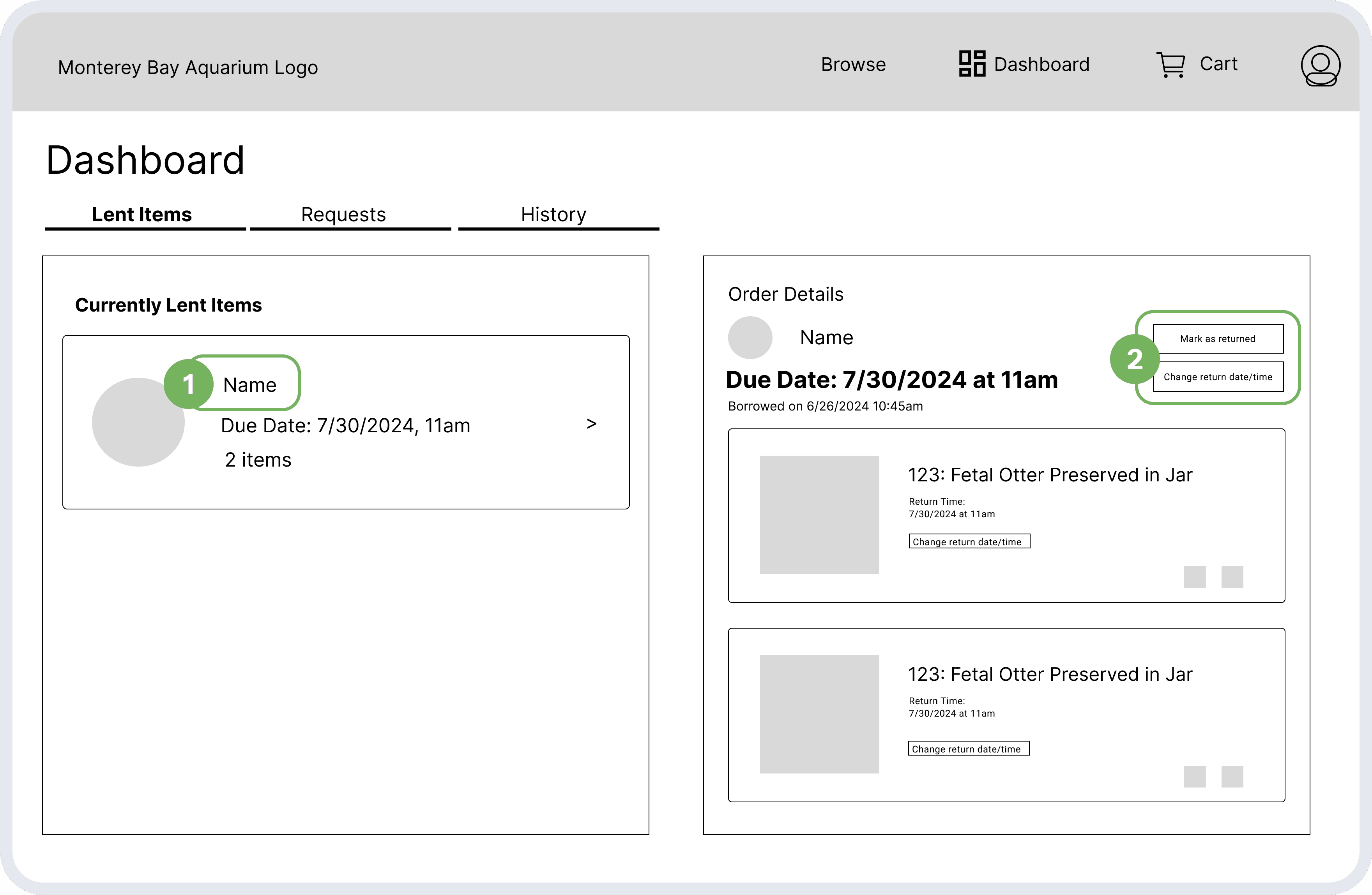
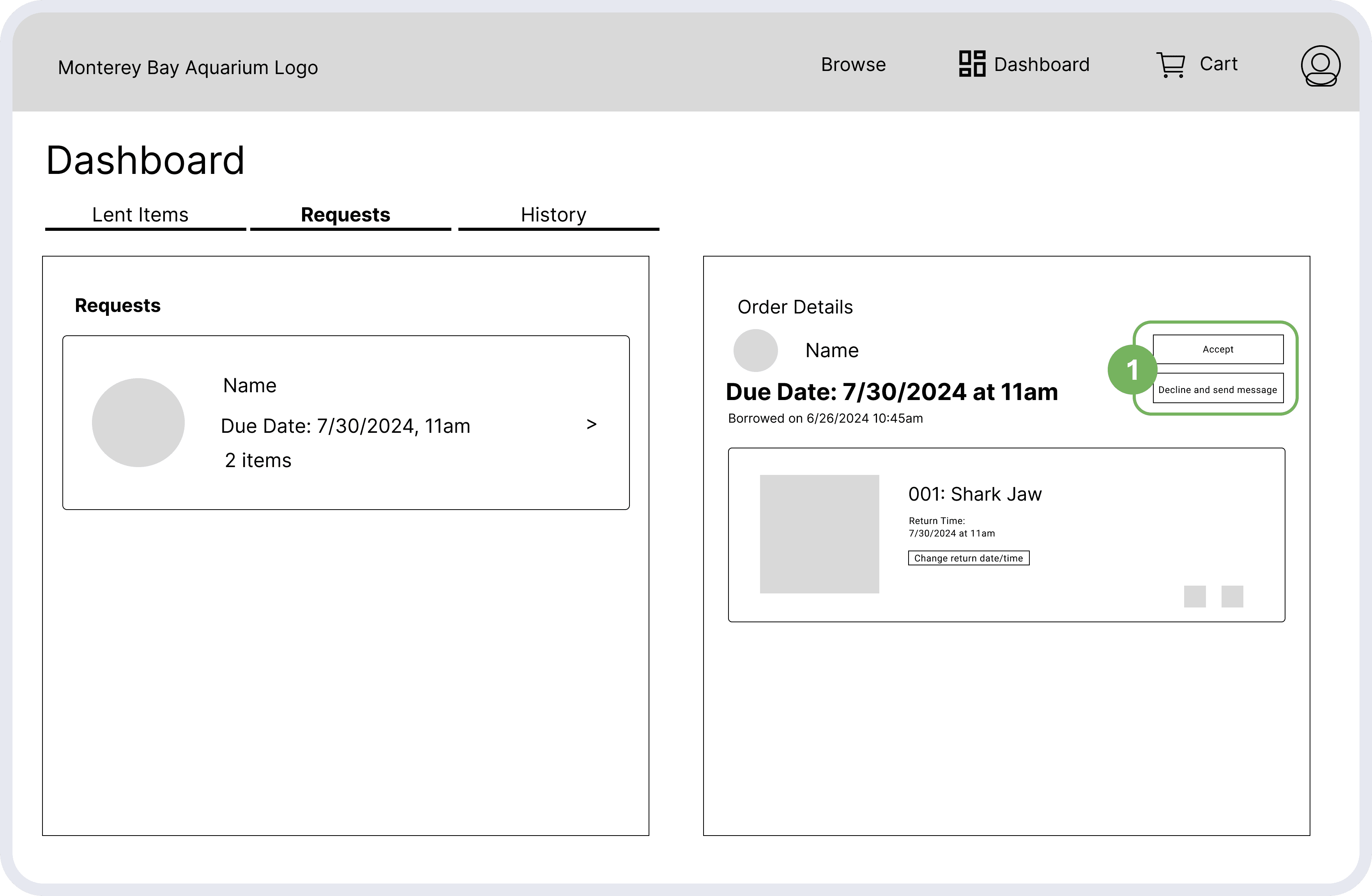
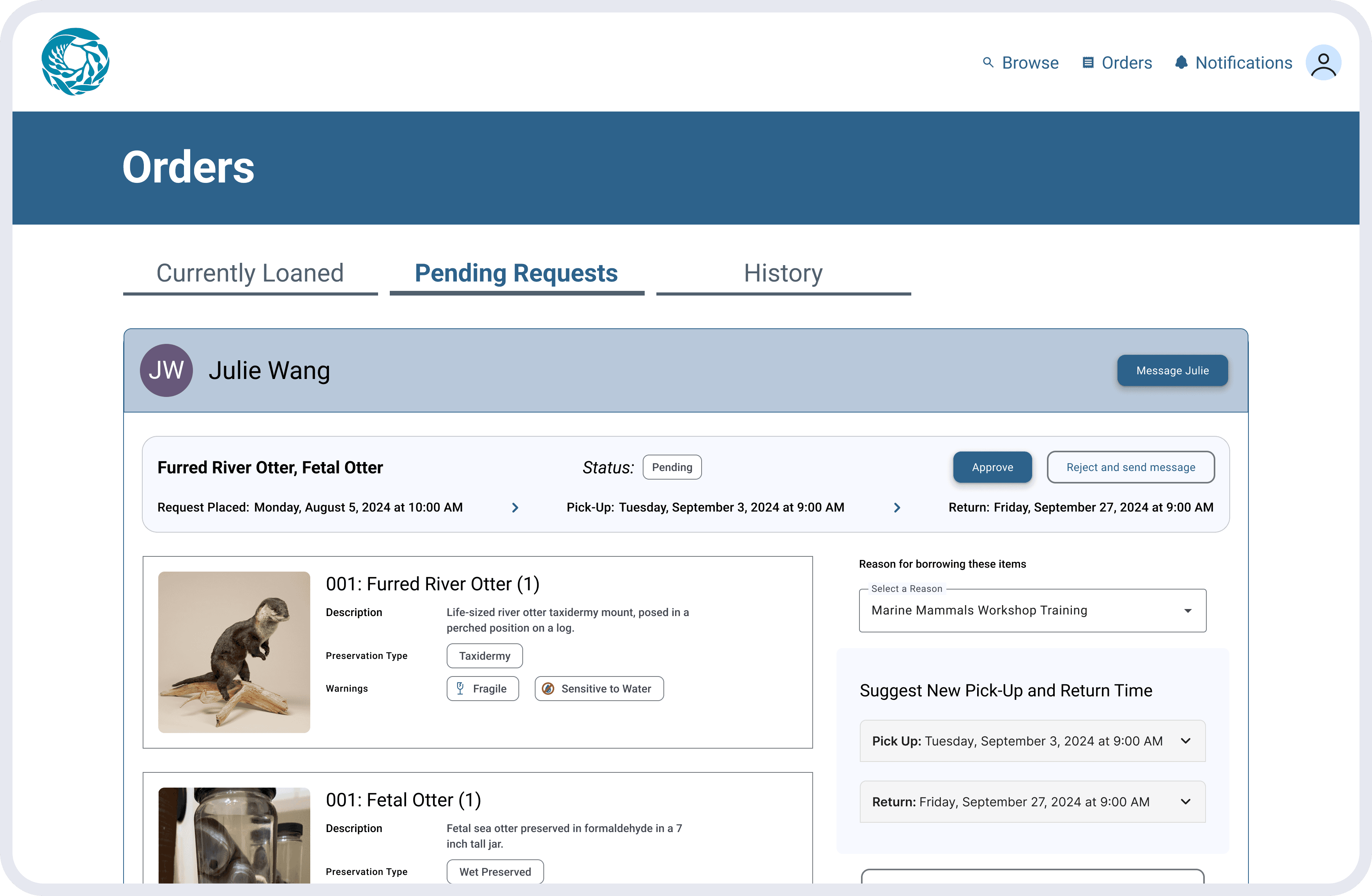
The Admin Dashboard is largely similar to the Requester Dashboard, only on the other side—this is where they receive the requests that are submitted. However, there are some slight changes so that Admins can recognize who borrowed items and can also either approve, reject, or modify the requests.
Admin Dashboard, Lent Items
1
Each request listed also shows the name of the requester
2
Admin can mark requests as returned, or change the return date & time
Admin Dashboard, Requests
1
Admin can either Accept or Reject (with modifications) requests
Admins also have power over the item entries in the catalog, so they are able to edit them or add new entries.
Feedback & Iteration
Since the Admin Dashboard is parallel with the Requester Dashboard, the same changes were made here: clearer tab labels and the layout change to one-column, while keeping the unique Admin capabilities such as the ability to approve, reject, or modify requests.
Admin Dashboard
This improves operational resilience, ensures continuity during absences, and creates a smoother workflow for the borrowing and documentation process.
Try out our prototype!
Our goal was:
Design a solution to allow MBA to scale their artifact management and borrowing system, and provide them with high-fidelity designs.
Did we achieve it?
Now it's up to MBA and future developers to bring it to life.
What's Next: Development
Partnering with the Monterey Bay Aquarium was an exciting opportunity, especially to work with an organization so close to home! Our main contact, Pamela Wade, was incredibly supportive and gave us the freedom to shape the project, allowing us to take initiative and carve our own path.
Our project tackled the major challenges in MBA's artifact management and borrowing system by creating a centralized database and streamlining workflows for both requesters and admins. The solution brought everything together with a cohesive inventory system, detailed artifact information, and a more efficient borrowing process, all designed to make collaboration easier.
By the end, we delivered high-fidelity prototypes, got positive feedback from usability testing, and packaged everything for future implementation—which was given to graduate software engineering students to create! These deliverables give MBA a scalable, easy-to-use system that’s ready to support their growing collection.
Impact: Modernization of Workflows
By fixing inefficiencies and making the process more accessible, MBA’s team can spend less time on tedious tasks and more time focusing on more important work. We estimate that our proposed solution would save approximately 3 hours per borrowing process—over half the time currently required—a significant improvement!
The artifact database we designed not only makes their daily work smoother but also sets an example of how technology can simplify managing valuable resources like cultural and scientific artifacts. It’s a great reminder of how thoughtful UX design can make workflows more resilient and sustainable in the long run!

