
As the UI/UX lead at Neoboard, I helped define the product’s structure, streamline its interface, and design new features in a fast-moving startup environment. I led a team of interns while collaborating with product and engineering to push the platform forward.
Role: UI/UX Lead (Intern)
Team: 3 Designers (led by me), Software Engineers
Tools: Figma, Google Suite
Timeline: 3 months
The org itself, as well as its extremely early wireframes, lacked hierarchy and clear structure. Pages were cluttered, features were underdefined, and internal teams struggled to collaborate effectively. The Figma file was disorganized, with overlapping designs, unlabelled frames, and no shared documentation, which made handoff confusing and slowed design momentum.
Example. Overcomplicated Site Map
This sitemap was reaching for the stars when there did not even exist documentation of what the company's mission statement was, what problems they aimed to solve, and what core functions they would offer to do so.

Example. Messy Files
Low-fidelity wireframes existed in no particular organization, with several UI components & their variations floating around. It was difficult to pinpoint what frame related to what, and what the intended user flow was.

I took initiative to organize our Figma file, creating clearly labeled pages for exploration, dev-ready assets, and archived work. I also set standards for naming conventions, component usage, and cross-team commenting. My focus was on clarifying user flows and feature priorities, starting with a redesigned dashboard that reflected clearer hierarchy and improved layout structure. I also revamped the tagging system, introducing a flexible pattern that allowed users to organize, add, and filter content.
Not only did I revamp the organization processes, but I also created high-fidelity designs that would ultimately lead the brand identity of the company.
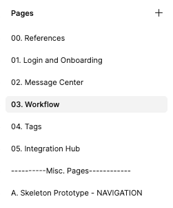
Example. New Site Map
I worked with the CEO to define what he wanted to do with his platform, and updated our foundational documentation to more clearly reflect what the platform should look like.

Example. New Organized Figma File
Nothing crazy, but a Figma file that separated between the major sections of the platform.
Example. MidFi Branding
This was intended as a "what-if" concept from me, but the CEO loved this and the other interns copied the aesthetic direction for all other wireframes.

Example. Feature Flow
I designed the dashboard and user flow of a core feature of the platform, called Tags.

The redesigned dashboard surfaced relevant student activity and upcoming deadlines, while simplifying navigation and content hierarchy. The tagging flow allowed users to apply, edit, and filter tags across multiple views, supporting better organization and discoverability.
Beyond the UI work, I introduced foundational systems that helped the design org run more smoothly — including structured Figma files, clear naming conventions, and documentation practices that made collaboration and handoff easier for both designers and engineers. These changes improved day-to-day workflows and left behind a stronger design infrastructure the team could continue to build on.
Workflows Dashboard

Tags Dashboard


Create New Tag Flow
This was my first experience leading a design team, and I learned how to provide structure, set standards, and take initiative in an ambiguous startup environment. I discovered how valuable it is to guide not just the visuals, but the design process itself — and how effective documentation can empower teammates to work more efficiently and independently.
